Topseller.com Product Details Page Redesign Part 1
Research – Interaction Design – Wireframes – Prototype
The problem we were solving
In preparation for some talks with this company I was asked to take a critical look at their Product Details Page (PDP) and do a redesign of it, applying best practices.
This is a two part series:
- Part 1, this part, deals with the analysis of the existing page and research on the subject,
- Part 2 of this project handles the actual redesign; the moodboard, the wireframes, the prototype and all that good stuff.
Asking me to take a “critical look” is a dangerous proposition… and let me be clear right away. I do not enjoy picking apart someone else’s work. There might be valid reasons why a design looks the way it does, even if I feel differently. But, we had to start somewhere, so I had to give it my best shot and look as nit picky as I could. Any suggested improvements are just that; ideas, suggestions and nothing more.
So, here we go…
Understanding the problem
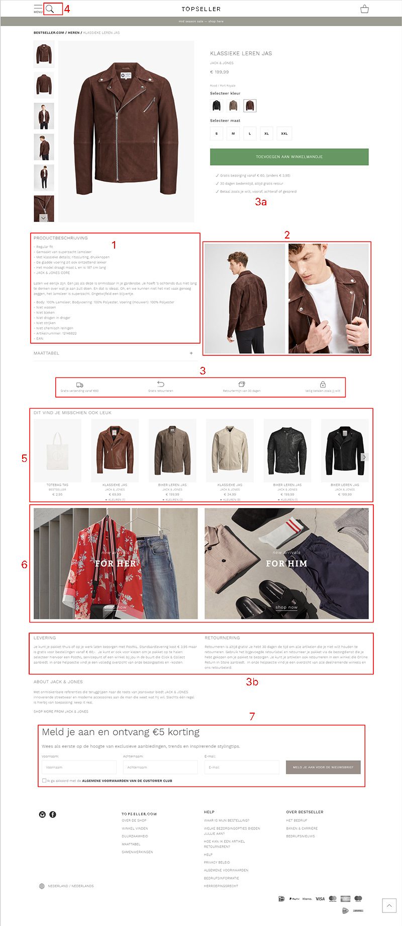
The existing PDP is shown here. At first glance, the design is quite nice, but once we dive in deeper a number of potential issues appear.
1. Weak product description
Boring copy, dull facts, and that font size is extremely small and causes legibility problems.
2. Repetitive imagery
Why repeat images that are also shown in the gallery? We should ask if that screen real estate could not serve a better function.
3. Repetitive information
Why do we include a whole section, with lots of whitespace, tiny icons and tiny microcopy, for something that was already said underneath the call-to-action (see 3A)? And further down the page we find an even larger section dedicated to exactly the same information again in full copy (see 3B).
4. Misplaced searchbox
It is convention to put search functionality in the top-right corner of a page. On top of that the magnifying glass does not bring search the way the user might expect, which will lead to a raise in confusion levels. For me, that also means trust will decline and that is not what I would want here.
5. Too much distractions from the product
In an attempt to serve the customer, the visitor is distracted from the product he is interested in.
6. More distractions from the product
Why do we offer totally different categories to our customers with images more dominant than the product photos? These would only serve a purpose when customers arrive here horribly misplaced in which case I would suggest taking a closer look at navigation for improvements.
7. Second call-to-action for newsletter
While not bad in itself, the pop-up that appeared after a few second with the same request was! If you put this section in your page, don’t disturb the customer’s flow with a pop-up.
Topseller.com Canadian PDP
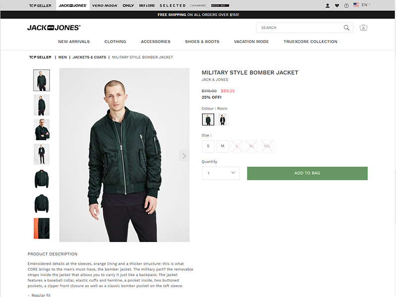
To my surprise PDPs from the same company in other countries looked differently. And actually better:
- Legibility was better.
The Dutch page used “Work Sans” – 300 – 12px.
The Canadian page used “Work Sans” – 400 – 14px. - Much more whitespace.
- No repetitive information.
- The search box was located where it should be.
- No distractions from the product.
- etc. etc.
Why do we not use a worldwide styleguide and design system?
Inspirational product pages 1
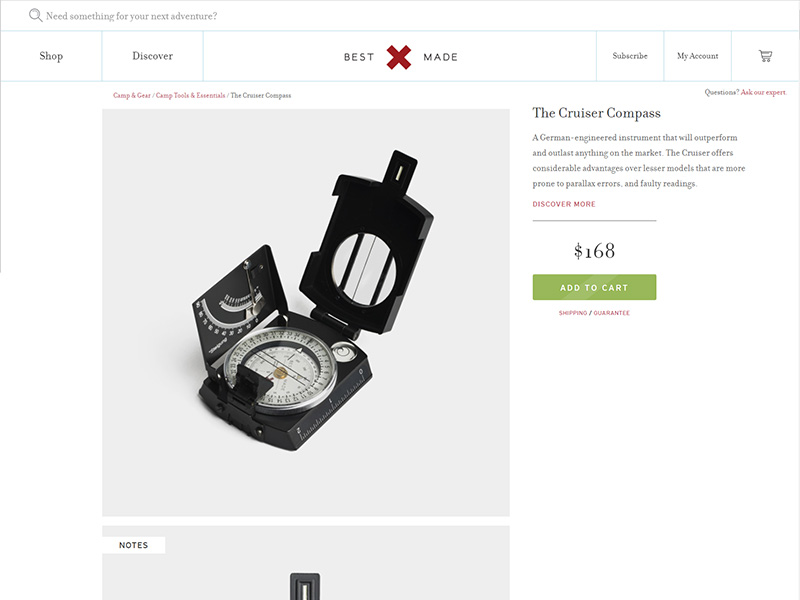
From Best Made Company we can pull quite a few best practices:
- Powerful product description; descriptive with buzzwords, proper font sizing and coloring for legibility.
- Their well placed call-to-action button could easily be animated to remain on screen at all time.
- Human contact without being intrusive and/or disruptive with pop-ups; a simple link is enough.
Inspirational product pages 2
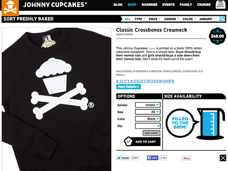
Johnny Cupcakes showed us some other design patterns:
- A unique social sharing hashtag, for promotion on Facebook and Twitter.
- An indication for stock; this can be a real trust builder. This could be linked to size selection, but then we do need some microcopy to make sure functionality is clear (learnability).
- Offering related (!) products for cross-selling.
Inspirational product pages 3
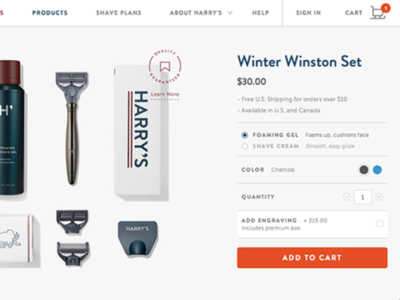
The Harry’s product page pointed us at:
- Clear and informative shipping instructions. There is no need to repeat this multiple times; this hints towards not trusting your audience and why should they then trust you?
- For full information on terms, delivery and such, this microcopy can be turned into links re-directing to different pages.
- Little tweaks to emphasize seasonality, such as Santa’s sledge. Just make sure things return to normal within a normal timeframe.
Inspirational product pages 4
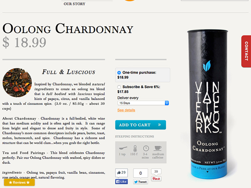
Vintage Teaworks does not sell directly to customers these days, but their old product page was very well built:
- Customer reviews are great for building trust.
- When applicable, a subscription based sales model can be very successful.
- Product specific instructions are great trustbuilders as well and can contribute to customer satisfaction, as well as reducing load on the after sales and support departments.
Inspirational product pages 5
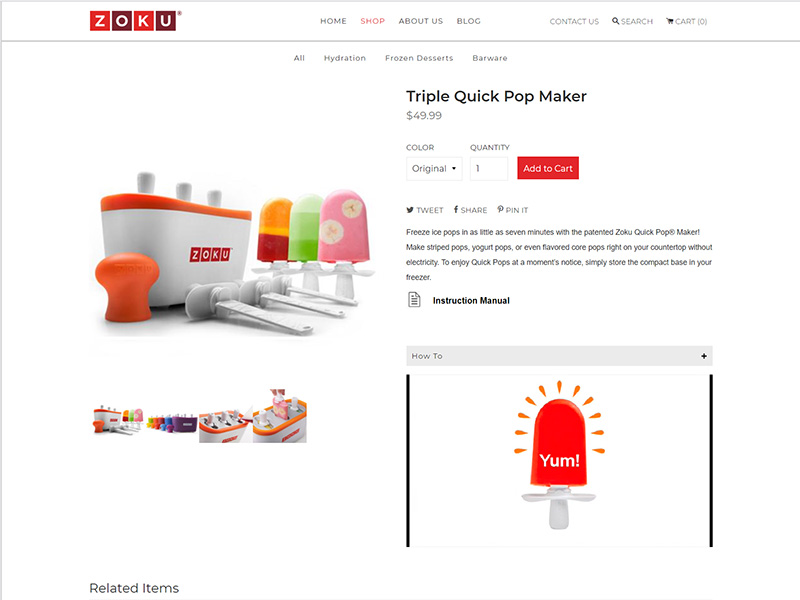
Zoku Home made use of one of the most important design elements:
- Whitespace!
- Every additional image was of value and gave more information to the customer; none were placeholder fillers.
- Finally, they gave me a craving for popstickles, but that’s a different story.
Inspirational product pages 6
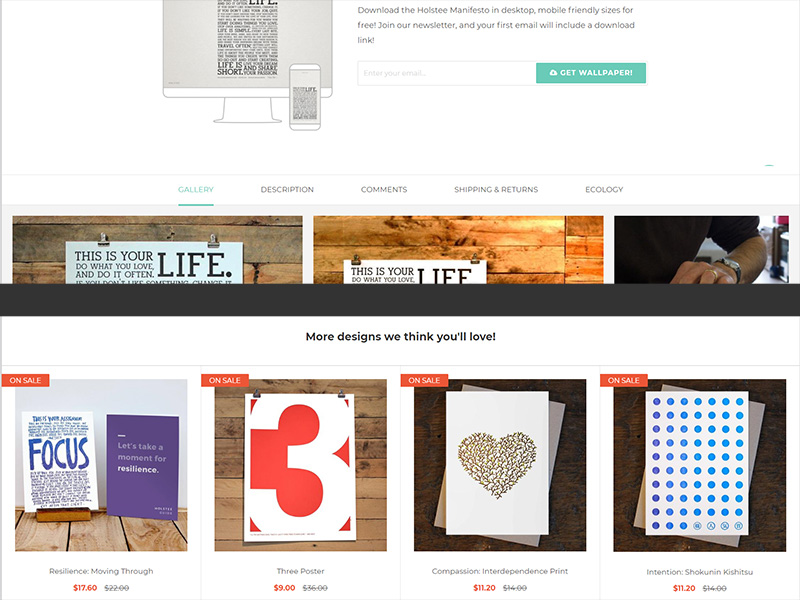
Holstee brought yet other design patterns to our attention:
- Tabular design (top section of image), allows for more information to be presented to your customer. Content hierarchy analysis is key for this to work.
- Cross-selling (bottom section of image) with selected products as an add-on to the original product of the page. You want to create additional sales, not alternative sales. Careful categorization is of value here.
Inspirational product pages 7
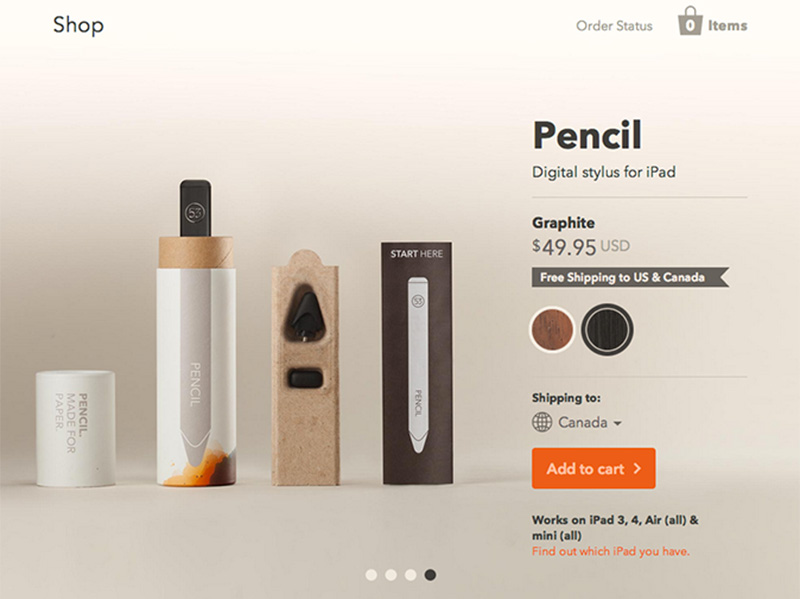
Pencil makes good use of microcopy to make sure the customer is re-assured about the what and why of the product.
If there can be any doubt about the use of your product, or the meaning of functionality on the page, explain it in a few words.
It’s not that difficult. And it is becoming common practice and expected by your audience. More and more hamburger menu’s are accompanied by the text “menu”, correcting an iconic design flaw for many.
Final words for part 1
“The paramount goal for you product pages should be to build user confidence by providing all the information necessary for a purchasing decision and making the process as intuitive and straightforward as possible”
— Rosara Joseph (Content Strategist @ VentureWeb)
Every element on your product page should contribute to providing information needed to make a purchase decision. Put differently, anything that doesn’t, should be left out.
There are four things that come together to create a truly great product page:
- Your product;
Obviously the center stage, and it should shine, but consider the questions your customers might have before purchase. - Your brand;
This is important everywhere, with the way products are found these days, your homepage may not be visited at all, so branding on the product pages is essential. - Your copywriting;
It’s the way you combine the written information your customers need with your brand’s unique voice and tone. - Your page design and user experience;
How things are arranged, and what’s included, can have a big impact on your conversions.
With all the above inspiration and information in mind, let’s get into gear and make stuff. Let’s move to Topseller.com Product Details Page Redesign – Part 2.
