Skoep 2.0 - Neighborhood News Startup Concept
Research – Interaction Design – Wireframes – Prototype
The problem we were solving
We worked out the concept on this exploratory project for a neighborhood news startup.
The agency was looking to change the way people find and consume local news. They wanted the design to feel and function in a modern way:
- Step away from the look and feel of a traditional newspaper or other online publication.
- Readers should be actively engaged with the content of the site.
- The whole experience should be more like social media.
- The journalism should be of high quality.
For this project we did a lot of research. We looked into the existing space, examined new unexplored territory, had lots of interviews and test sessions with members from the audience and all that good stuff. However, we will not dive into that here; there are other projects in my portfolio where I take a close look at how to perform high quality research.
Focus of this article will be the different deliverables during this process. There is a lot more to “deliverables” than a working prototype every sprint. Let’s see.

Main Deliverables
For this project we were requested the following:
- Screen flows and wireframes for:
– the homepage,
– the neighborhood search page,
– the user profile page,
– the category page,
– a sample article page. - Sketches and moodboard
- User flows
- Use cases
- Sitemap
- Wireframes
- A prototype of an article page
- Styleguide
We had to look at this from a mobile first approach.
Research Conclusions
In conclusion we felt that the news site should focus on quality content, with the social interaction being promoted, yet not relied upon for revenue.
This means:
- Seek professional writers to bring in content in exchange for pay.
- Seek local experts to bring in content in exchange for exposure.
- Moderate user discussions to maintain quality levels.
– It’s recommended to limit interactions to certain topics. - Use a subscription model for users.
– This limits noise within social interactions to some extend.
– It provides a means other than advertising to generate revenue.

User Personas

Research on the target audience for the local news site was already done by the agency. We had a quick look at the results and brought them into a template.
Important to us was to look at the different types of visitors the product would draw:
- The reader who doesn’t care about interaction but only wants a dose of good quality local news.
- The reader who engages in conversation and wants to meet locals.
- The expert who uses this product to promote products and services.
- The resident who needs to find a local expert, product or service.
- The journalist who wants to publish his articles and make money.
| Use Case 1 | Register for an account as a reader (free/pay) |
| Actor | Visitor |
| Overview | An unregistered visitor wants to become a registered user by filling out the appropriate form. |
| Personas | Marianne / Willem / Kristel / Thea |
| Trigger | Clicking one a “register now” button somewhere on the site. |
| Basic Flow | 1. Fill out form fields for a user: Name / Email / Province / City / PW (2x) 2. Select the option “free subscription”, 3. Click “register” button, 4. Receive confirmation mail, 5. Click confirmation link. |
| Alternative flow 2A | Paid subscription instead of free membership |
| Actor | Visitor |
| Overview | User wants a paid subscription to access all local content. |
| Personas | Marianne / Willem / Kristel / Thea |
| Trigger | Selecting “paid subscription” during registration. |
| Basic Flow | 2-A1. Select the option “paid”. 2-A2. Fill-out payment information. 2-A3. Click “register”. 2-A4. Process first payment. 2-A5. Receive payment conformation mail. |
Use Cases
Although they might seem similar on the outside, use cases and user stories are not the same thing.
Use cases are written descriptions of how users will perform tasks. It outlines the system’s response; represented in a sequence of simple steps.
User stories are written descriptions from the perspective of the user, detailing a goal and a reason or benefit for that goal.
As a guideline you could say that use cases are beneficial for identifying problems within your system, and help identify what your system needs. User stories are the smallest elements in planning that go on the backlog for the development team to build as they represent the individual tasks users want to perform.
For the neighborhood news site, we found (a.o.) the following use case:
- Register for an account as a reader (seen here).
- Register for an account as a journalist / local expert.
- Login to an existing account.
- Browse articles in the news feed.
- Read an article.
- Comment on an article.
- Write an article.
- Change profile settings.
- etc. etc. etc.
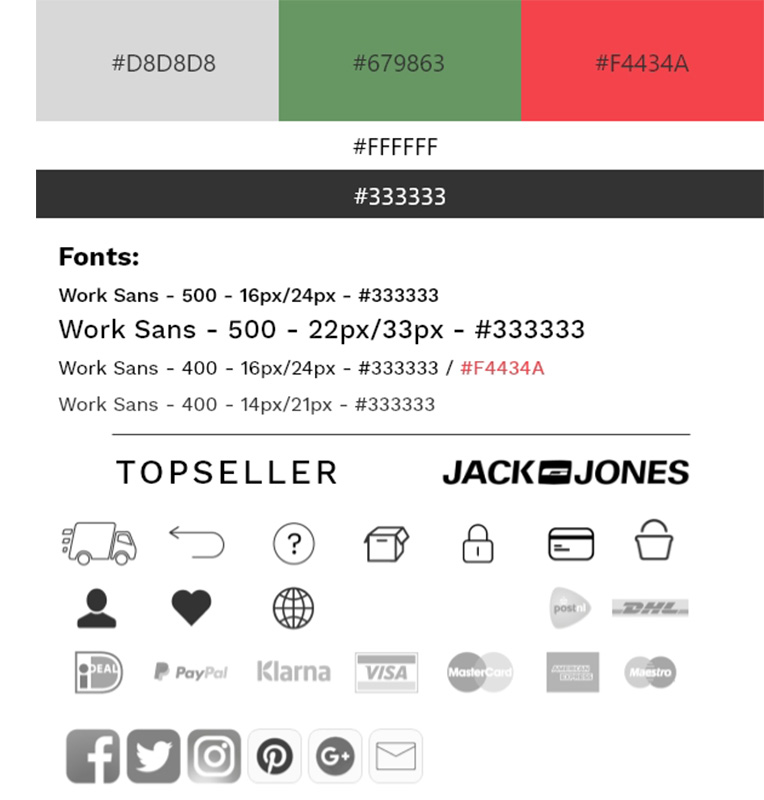
Style Guide Proposal

There are many ways to set-up a style guide and over time a more extensive one should be put together.
For the initial discussions about the prospects of this product, this one will do just fine.

Sitemap
The sitemap is a schematic representation of the web hierarchy. It shows the different tiers of page levels. It should also clarify the overall structure of the product.
User Flow Chart(s)
There are many ways to map out user flows, each with various levels of detail.
Because our deliverables were going to be used to negotiate deals with investors, we decided to use wireframes in the user flows. While a bit more work, it would provide a more appealing image to talk about and that was in the best interest of our contractor.


Sketches Sketches Sketches
Lots of sketches were made. First rough pencil sketches, as shown at the top of the image. Later we used templates to draw both mobile and desktop versions of the different pages we were including in the model.
The assignment only included about five wireframes, but to create the user flow the way we wanted, we had to draw quite a few more.
Wireframes - Homepage
Here we see the final sketch and the wireframe side by side.
While it is common practice to only use grayscale for wireframes, when sketching I like to add a few colors to make the purpose of certain areas clearer.
- Blue means navigation.
- Orange are images.
- Green are forms.
- etc.
Always remember that you might sit in on a meeting with people who do not know all we do about UX, but are experts in their own right.


Wireframes - Article Feed
Even though there seems to be little difference between sketching and wireframing, it is my belief that both play a vital role in the design process.
From sketching to wireframing and prototyping allows the team to add more detail each time. Or, early in the process focus and discussion can be about the global aspects of the design; the hierarchy and structure. Later we can worry about the size of each icon and whether this or that should be a pixel smaller or larger.
Prototype - Mobile
Yes, we finally have arrived at the deliverable everybody is looking for… the high-fidelity prototype.
I will show both here; mobile and desktop.
The design in itself is not spectacular. And it should not be at this stage. Everything on it is functional. You want these to be ready for talks with investors. Thinking about fancy animations and creative graphics is for a later stage.
The mobile version is straightforward. Somewhere, at a later moment, there should be room included for advertising. For now, we can do without the clutter.
The desktop version has two sidebars where the advertising could go. (see below)

Prototype - Desktop