We need a Dashboard
Interviews – Workshops – Interaction Design – Wireframes – Prototypes – User Testing
The problem we were solving
Well, actually, the request was: “We already have a dashboard ready for release, we just need your magic to make it look beautiful.”
Right… err, wrong!
This is a common problem UX Design faces. Involved too late in the process, we are presented with a well-intended, yet questionable solution for… what? And when we try to ask the important questions that should have been asked much earlier, there is no time, nor interest.

It's all about Agile, isn't it?
We can’t blame development teams. They should focus on getting that product out, not questioning it. So, UX Design tries to accommodate and wield our magic wand. But should we really? We need to be careful not to confirm the wrong image many have of our profession.
This particular case was illustrative for a common issue UX people face. A solution was being presented as final, while understanding the problem had been ignored. Defining the problem not only brought a better solution, but it also provided such insights that other more dedicated solutions were included in the work as well.
And it is this last part I want to focus on here. We will take a quick look at the dashboard, but then we will dive into an interesting use case that we solved quite elegantly.
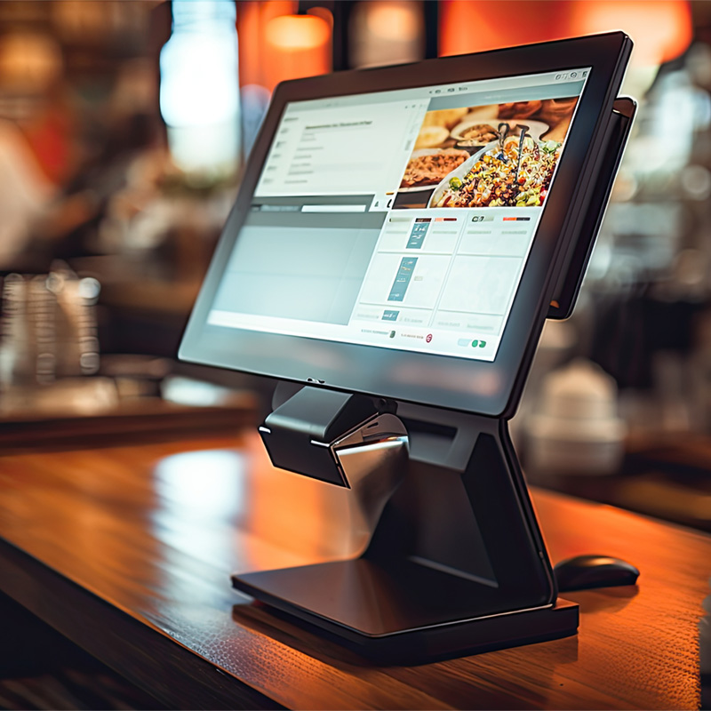
The Dashboard
We were presented with the existing ‘dashboard’.
There was a lot wrong with this design:
- Fundamental issues with basic Gestalt principles, such as grouping, and distance come to mind.
- But also, is all the important information visible when needed, are we not overloading the user with information that is not needed, is scrolling down obvious to the user?
- And finally, simple context of the content presented. What does it mean, why are we looking at it, what are we supposed to conclude from it if anything?
Dashboard design is not easy. Far from it. Contrary to popular belief it is not so much about showing data. And certainly not about cramming as much data into a single screen as technically possible.


Dashboard Design Done Right
Good dashboard design is about:
- Visualizing large data sets in a clear and concise way.
- Telling a story that invites further exploration and learning.
- Allowing for signal triggers that will enable actions to be taken when needed.
So, we needed to ask some basic questions to airline management, and it quickly became clear there were two major needs:
- For technical purposes and maintenance, visualizations of what was happening in the background, and signals to alert when something went poof.
- For everyday operations there was a need for insights on things that were lost to airline agents because of the self-service nature of different stages.
Progressive Disclosure...
For the dashboard we set-up interview sessions with technicians and operational managers to find out what it was they needed and why they needed it. An additional workshop on playing around with different visualizations lead to an improved initial design.
Navigation was made more intuitive based on user input. Furthermore, progressive disclosure of information was introduced into the dashboard, also based on user needs.
That’s all for the dashboard. Now. let’s look at one particular use case that stood out.


Self-Service Boarding
During our conversations with airline staff, we were told the following issue they had to deal with:
- In staff handled boarding, the agents would keep track of how many passengers they had processed. This was important for several reasons among which that at a certain point of the boarding process, they would inform the captain he could start going through his checklists and fire up the engines.
- And then came Self-Service Boarding, where passengers move through gates and are processed automatically. Suddenly the one or two agents overseeing the process had no insights or context on how far boarding had proceeded. And so, among other things, the start-up sequence of the plane became less efficient (read: more costly).
Making the Solution Specific
At first, the obvious solution was to include tracking the boarding process in the dashboard. However, observations of multiple planes being boarded showed agents moving around all over the place, providing hand-on support and assistance where needed. This called for a more mobile solution.
Hence the idea was born for a light-weight mobile solution.
Turned out this could be a relatively simple application. During the earlier mentioned workshop, we had already played with this idea and after minor refinements we could move forward. The amount of information needed was such that for once we had an abundance of space on our mobile screen, so we even added a fancy visual animation.

Dedicated Self-Service Boarding App for Airline Agents

On the left an example of the ‘dashboard’ screen, on the right a presentation image of that same screen in a mockup. And yes, we fiddled with an airplane database to match the screen image with the actual plane being used for a particular flight.
The ‘Schedule’ allowed for switching between flights and with ‘Search’… well, you could search for a flight. Neat, clean, easy to learn. What’s not to like?
What came next?
Well, disappointment, I guess. The airline we were collaborating with, and which was set-up for testing the app was… Aeroflot. And then a certain Russian President decided it was a good idea to invade a neighboring country and working with Aeroflot came to a screeching halt.
Of course, finding another airline to test this with should not be too difficult. However, for me that was all she wrote, as I decided to move on and accept an offer from another company.
Still, this project was a good example of how even false starts can lead to a good solution that will be adopted by users, as long as there is wiggle room to learn, understand, and change directions when needed. Some will say that too much time was spent on research, where modern day Scrum asks for continuous development, but I would argue that most of the time that so-called continuous development in real-life consists of spitting out features that are never re-visited and therefore are not built using multiple iterations.
Yes, the above process was mostly research and design, but could have been done in a true agile environment using consecutive iterations / sprints.