Form Design - Newsletter Sign Up
Research – Interaction Design – Wireframes – Prototype
The problem we were solving
Not so much a problem, but a question: “Can you design a good newsletter sign-up form for me?”
Let’s look at the different steps we went through:
- Find examples of good sign up forms,
- List best practices,
- Generate ideas,
- Wireframe & Prototype,
- Validate through testing.
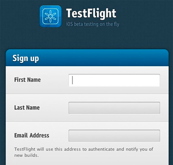
What makes this a good sign-up form?
- Simple styling,
- Extra padding on the rows,
- Clear indication of the active field.
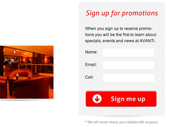
What makes this a good sign-up form?
- That big bold colored button,
- The clear statement on the button.
- On the downside: there is no need for the black copy, the red title says it all.
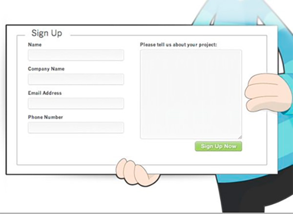
What makes this a good sign-up form?
- The illustrated character holding the form brings a lot of, well, character to the page,
- Identity matters.
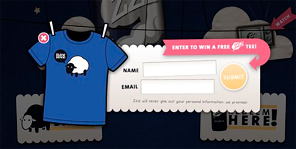
What makes this a good sign-up form?
- The tilted text fields work here,
- Playful forms have their time and place,
- Knowing your audience is vital.
Sign-up form best practices
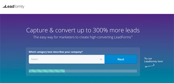
Multi-step forms out perform single step forms.
- The first impression is less intimidating than a long form with lots of fields,
- Ask for sensitive information in the last step; users have already invested energy in filling out the previous steps,
- Seeing a progress bar motivates users to finish the task.
Sign-up form best practices
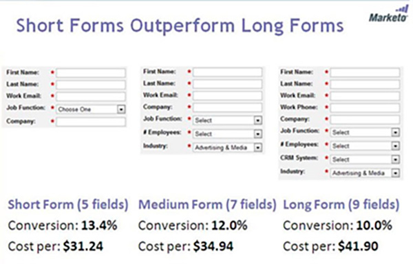
Remove all non-essential fields:
- Every additional field will loose you leads,
- Carefully consider the trade off between gaining information and less opt-ins, or gaining less information and more opt-ins.
Sign-up form best practices
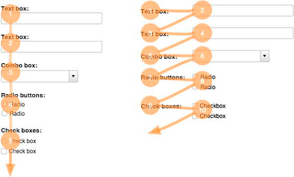
Top-left aligned labels are best for readability and completion.
- Research done by Google UX Researchers,
- Less visual fixation means higher rate of completion.
Sign-up form best practices
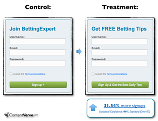
Give people a reason to use your form.
- Motivation is key for form completion rates,
- A form that would take an hour to complete…
– Nobody would fill that out, right?
– Well, what if at the end you would get a Ferrari?
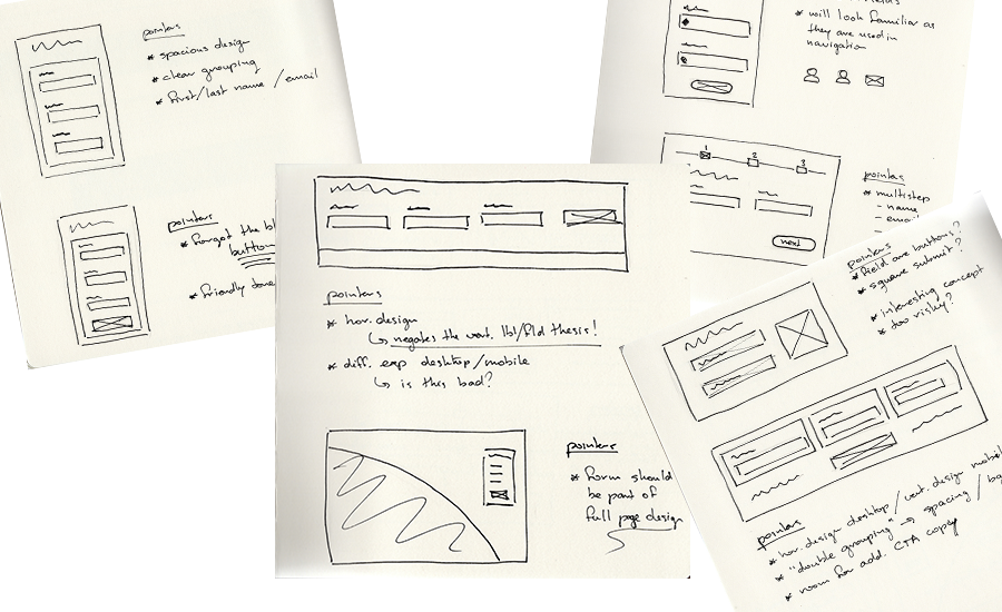
Generate Ideas
The creative process to generate a well designed solution has as many roads as there are designers.
For me, I like to wonder into one direction, until things get uncomfortable, then return to a well known pattern and start over. In the end, review and combine.
For this sign-up form, the final design was based on:
- Using a spacious design, where we can group labels and fields clearly,
- An obvious CTA button with inviting micro copy,
- An overall friendly tone and attitude worthy of a restaurant where you want to wine and dine,
- A full page design; the sign-up form must be part of the atmospheric experience of the site.
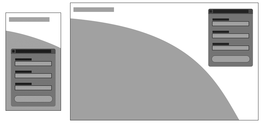
Wireframes
When designing a responsive page I start with the extremes; a mobile version and a full desktop version.
Anything in between will come to me in breakpoints by itself.
Here my two main guidelines were:
- The form dimensions stay the same, this ensures a constant user experience filling it out.
- Positioning and background image change, but the feel should remain constant as well.
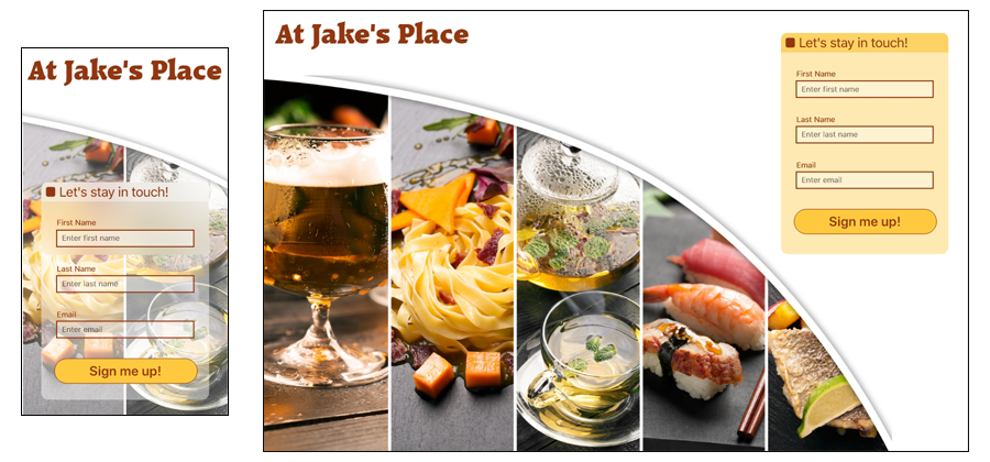
High Fidelity Prototypes
Question: “What am I signing up for?”
Remember that this sign-up form follows a click on a link somewhere, like “Sign up for our newsletter and receive seasonal updates once every three months!”
During testing we simulated this scenario, so there was no doubt what was happening, but you could consider including a sub-title repeating the link copy.
