Finnley's Checkout
Interaction Design – Wireframes – Prototype – User Testing
The problem we were solving
Analysis showed too many customers who abandoned their purchase when arriving at the checkout page.
Our job was to find the reason why and come up with a solution.
Assembling the Team
We tackled this problem with a small team:
- The product owner – the owner of Finnley’s,
- The web developer – hired by the product owner,
- The UX Designer – that would be me.
Understanding the Problem
We executed a “talk-out-loud” test, followed by an interview.
The talk out loud session was very simple and had only one task:
- Purchase a single item from the online shop,
namely the Fresh Pie Chicken & Sweetcorn.
The interview was also kept brief and simple and consisted of the following sections:
- Question to establish demographic characteristics,
- Questions to establish behavioral characteristics,
- Questions about satisfaction and preferences.
First Conclusions
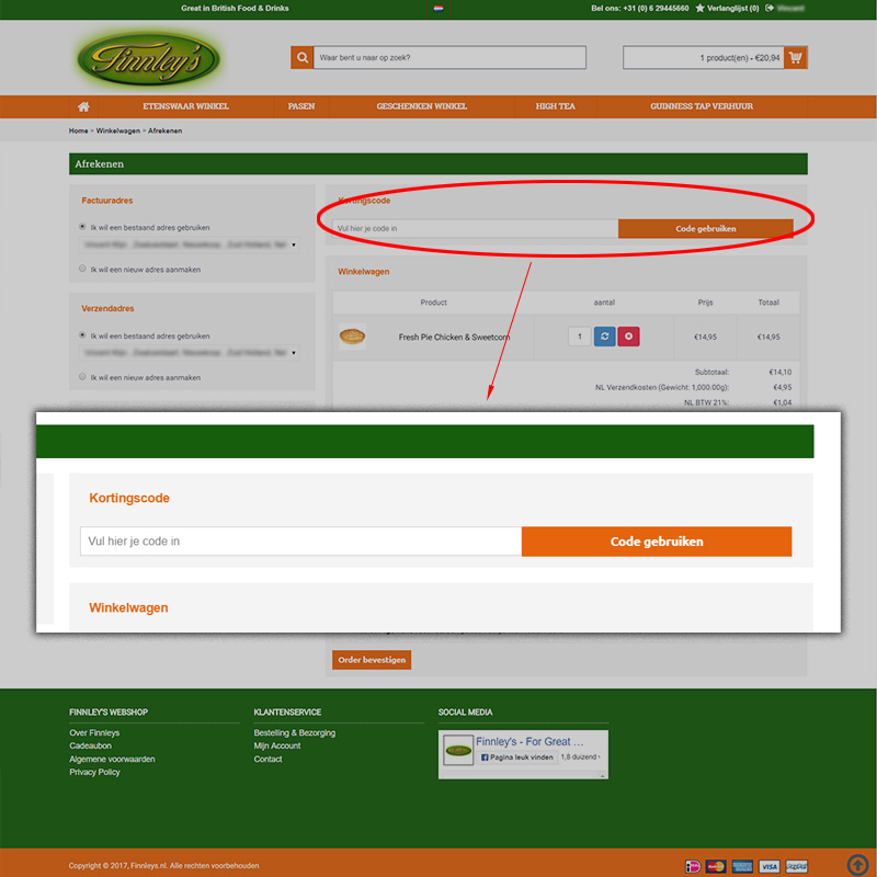
Both tests made it clear the discount coupon field was the source of our troubles:
- Users wondered why they had no coupon code,
- The position of the field made it hard to overlook and/or ignore,
- Finnley’s offers non essential food products, which made potential buyers turn away easier.
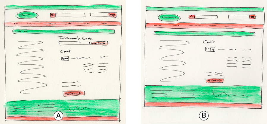
Looking for Confirmation with an A/B Test
Measurable Result
With 72.8% vs. 77.2% we have 6% more customers finishing the checkout without the coupon field present.
This is in line with the design principle that less form fields is better. Whenever we can, we should limit the numbers of distractions we present the customer.
Offering an Alternative to the Client
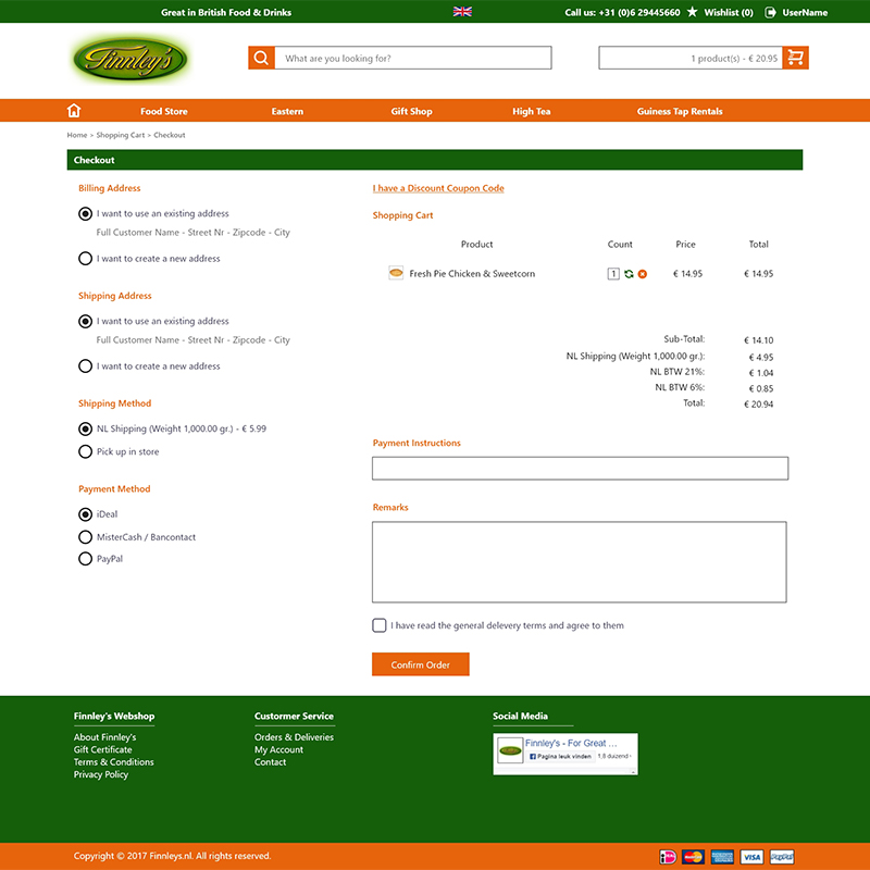
The client did not want to omit the coupon code field, because it had fundamental functionality.
We therefore presented an alternative layout where the coupon code field could be reached by clicking on a link. This way the functionality was still there, but less obvious and less intrusive for the majority of customers.


